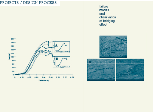
The results of the tests were gathered in tables and charts. They were redesigned using the overal visual style - redrawn in Adobe Illustrator. The revised visual design facilitates data comprehension.
The new styling avoided visual noise. Deemphasizing the data grid enabled the comparative findings of the data to emerge.
The new styling avoided visual noise. Deemphasizing the data grid enabled the comparative findings of the data to emerge.
next
2
3
4
designing the parts : restyling the charts
reference images and original charts were used to design a visually flowing sequence for "failure modes and observation of bridging effect"
reference images and original charts were used to design a visually flowing sequence for "failure modes and observation of bridging effect"

1


